Mobile devices are increasingly important to the performance of your business, whether you’re an eCommerce retailer or a local business trying to increase foot traffic. But if your website isn’t optimized for mobile devices, it could be costing you valuable customers and sales. These 8 tips for optimizing your mobile website for better performance:
Tip 1: Create a Responsive Design
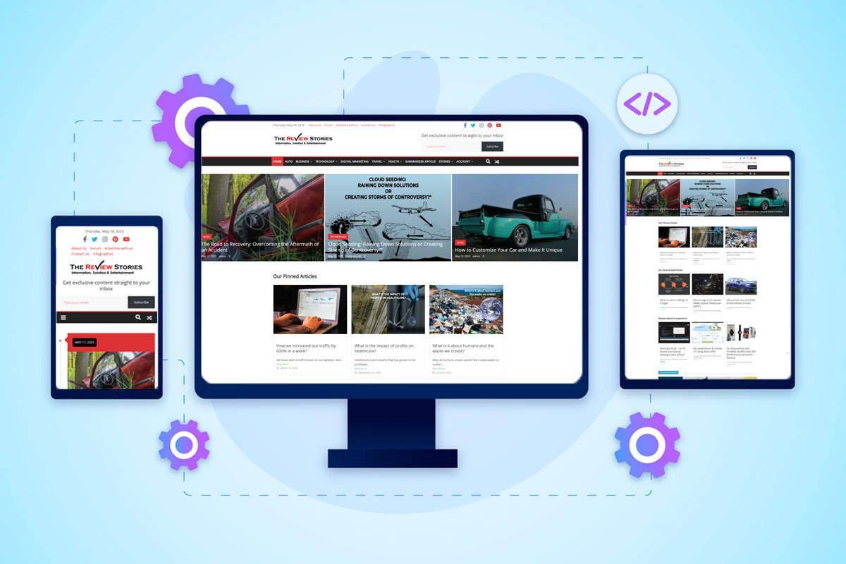
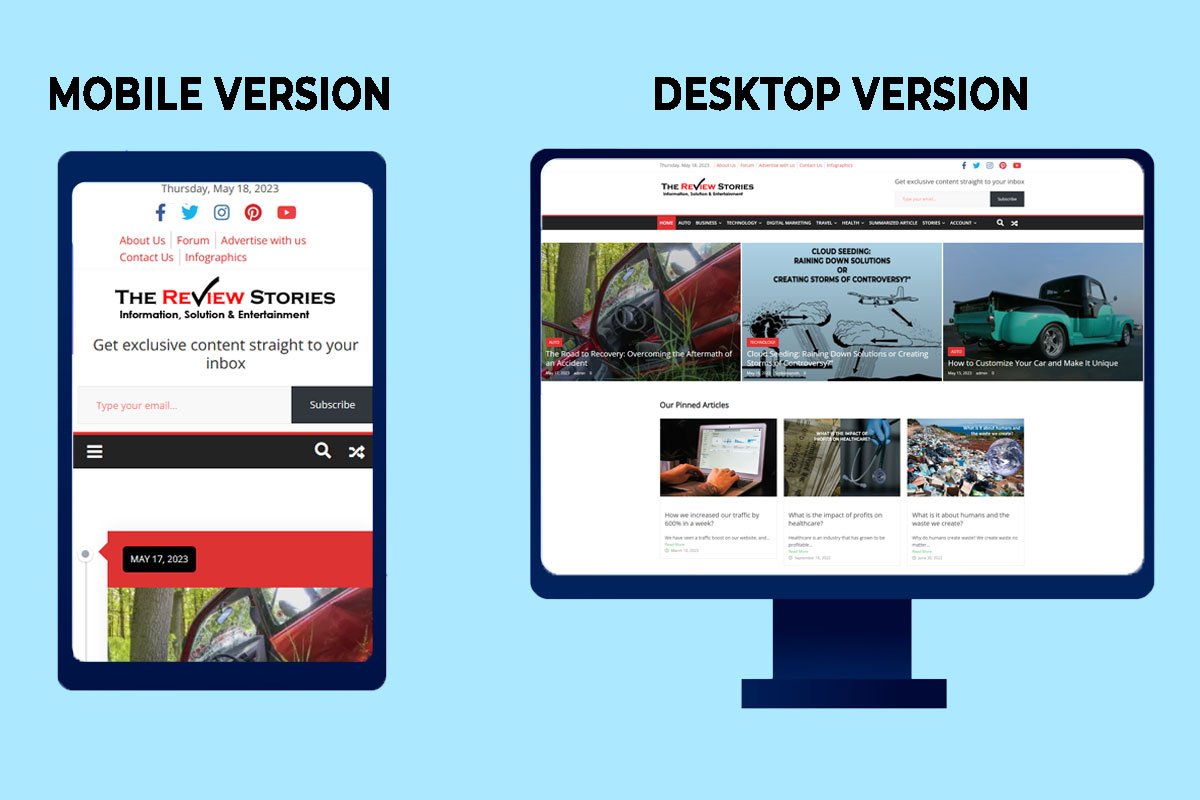
Responsive design is a website development technique that allows a site to adapt and change its layout based on the device being used to view it. If you’re on a mobile device, your website will adjust accordingly so all elements fit the screen size and orientation.
There are many benefits associated with having a responsive website:
- Improved usability – Users can easily navigate through pages without being frustrated by poor navigation schemes or complicated processes.
- Better user experience – Users won’t need special apps or plug-ins because everything works as expected.
- Increased traffic – More people will visit since there aren’t any barriers preventing them from doing so.
- Increased conversions – More people will be able to complete tasks on your website, which results in more sales and revenue.
- Decreased bounce rates – People will stay on your website longer since it’s easier to use.
Tip 2: Optimize Load Times
You can test your site’s load times using Google PageSpeed Insights. Your web page will undergo a performance assessment and receive a score, along with helpful suggestions to enhance its performance.
If your load times are too long, consider optimizing images by compressing them or converting them to a lossless format such as PNG-8 or GIF or a WebP format which maintains the quality but reduces the size. You should also minify CSS and JavaScript files—this means removing unnecessary whitespace from code so that it takes up less space on the server and in browsers’ memory caches (which improves rendering performance). If you’re using caching strategies like web fonts or images that aren’t changing frequently, make sure they’re being served from a CDN instead of directly from the origin server where they live; this will help ensure optimal access speed for users who visit multiple pages within an application or website throughout their session on mobile devices.
You can further enhance the performance and reduce load times by leveraging a content delivery network (CDN). With a CDN, your website’s assets are served from servers located in close proximity to the user. This approach works wonders in optimizing performance, ensuring that visitors experience faster load times and a seamless browsing experience.
Tip 3: Prioritize Above-the-Fold Content
The first page of your mobile website is crucial for performance. The area above the fold is where visitors form their first impression of your site. Therefore, it’s vital to prioritize content that appears in this section, as it can significantly impact their decision to remain on the site or not.
When it comes to prioritizing and optimizing above-the-fold content, there are two main things you should keep in mind:
- Make sure all key information is visible within five seconds of loading the page (this includes any navigation menus). If there isn’t enough room for everything at once on one screen, consider using dropdown menus or scrolling lists instead of forcing users into multiple clicks just to get what they need from each section of your site.
- Use text over images whenever possible—they load faster!
- Ensure that the images you’re using are optimized for mobile devices. This means making sure they are small enough to be displayed on a relatively small screen while still maintaining their clarity and readability. Optimizing images this way will allow users to access all the information on your site quickly and easily, which is what counts most in terms of ranking well in search engines.
The following guidelines may not apply to your specific situation. For an e-commerce site, you should prioritize displaying your most popular products and services upfront in order to facilitate user navigation. Conversely, if your website primarily serves as an information hub with abundant content, it might be more beneficial to present all your articles on a single page, preventing visitors from feeling overwhelmed by an excessive number of choices simultaneously. You can also have a different layout for your mobile website when compared to your desktop version.
Tip 4: Optimize Images and Videos
Optimizing images and videos is an essential step to ensure that your site loads quickly on mobile devices.
- Convert video and audio files into much more versatile formats. This will allow you to reduce their file sizes without losing quality, so they can be accessed by all types of devices. To optimize your audio files for mobile devices, consider using an MP3 converter. This powerful tool enables you to convert audio files into the widely supported MP3 format, ensuring compatibility and preserving audio quality while substantially reducing file sizes. This is particularly advantageous for mobile users with storage constraints or slower internet connections.
- For instance, if you need to convert a file from M4A to MP3, a converter tool provides a simple and efficient solution to facilitate the process seamlessly.
- Compress and resize images before uploading them online, as this will help reduce their size dramatically. You can also use image compression software (like TinyPNG) after uploading them if necessary.
- Lazy load content when possible (for example, don’t load all the images on a page at once), since this will improve performance by avoiding unnecessary network requests during initial page load time.
- Use responsive video players whenever possible because they adapt automatically depending on which device is accessing them.
Tip 5: Minimize Redirects
Redirects are used to move users from one page to another. Suppose you possess a mobile website that has numerous subdomains such as m.example.com and www.example.com. In that case, if you desire to direct the visitors who access m.example.com to the same content as those who came from www.example.com, you can establish a redirect from m to www. By doing so, every request for /m would be automatically sent by your server to /www without any user intervention or the user’s awareness of the redirection occurring in the background on their device’s web browser.
Redirects can negatively impact performance because they add additional requests for data from the server and increase latency between client and server which slows down page load times—especially when there are many redirects involved or if those redirects are located further away geographically than where your primary content resides (for example: if there are several levels deep within your site hierarchy).
Tip 6: Enable Browser Caching
In order to display a website, your browser downloads the files and resources it requires. As you visit new pages on a website, your device has to download all those files again and again. Browser caching allows users’ devices (and other intermediate proxies) to store copies of these resources locally so they don’t need to be downloaded every time they visit an identical page; instead, the browser can retrieve them from its cache instead. This reduces load times since there are less data being transferred over networks!
To enable browser caching on your mobile website:
- Enable ETags for each resource file (e.g., CSS/JavaScript files). You can do this by setting response headers in your server code or adding an appropriate meta tag in the HTML source code.
- Use a far-future expiration date for your cached resources. This will ensure that the cached version of the resource is not expired until after the next release of your mobile website (which should be at least several days out).
- You can do this by setting response headers in your server code or adding an appropriate meta tag in the HTML source code.
Tip 7: Test and Monitor Performance Regularly
Testing your website on different devices, specifically mobile devices, is crucial. While your site may appear fantastic on a desktop computer, it’s crucial to ensure its smooth functionality on mobile devices. Failing to do so could result in missed opportunities with potential customers who prefer browsing your site on their phones or tablets.
You can also use web tools that monitor performance so that you know what elements are slowing down your site and how users are interacting with it (e.g., how long they stay). This information will help in identifying areas where improvements could be made and the site could be made more user-friendly.
Tip 8: Use Conversion-Optimized Landing Pages
The last tip is to use conversion-optimized landing pages. A landing page is a powerful tool for promoting and advertising your business online. The site urges people to join an email list, download an ebook, or make a purchase.
To enhance your mobile website’s performance, consider conversion-optimized landing pages. A mobile-specific page is designed to maximize conversions and improve user experience, so you can interact seamlessly and effectively with your site anywhere. These types of pages are designed with mobile users in mind so they load faster on devices like smartphones and tablets than traditional desktop websites do (which often have larger images and more code).
In addition, they usually use less bandwidth than full sites because they don’t have as much content on them—they’re just meant for one thing: getting customers into the door! This makes them ideal for mobile devices because it means less waiting around while loads finish loading before users can see anything useful on screen.”
Conclusion
We hope that these tips have helped you to understand the importance of optimizing your mobile website for performance. Having good performance on your website offers numerous benefits. It not only enhances the user experience and boosts conversions but also sends positive signals to search engines like Google and Bing. A well-performing site indicates speed, reliability, and trustworthiness, which can enhance your search engine rankings and improve your visibility. Do you have more tips for optimizing your mobile website please let us know in the comments.
