Web design is not an exact science. But that doesn’t mean there aren’t basic web design rules and principles you can follow to produce a certain result.
To have a positive, lasting impact on users, you need to adopt web design principles with proven results. As the web design industry continues to thrive, there’s no short supply of inspiration and guidance to push you forward.
Regardless of the type of website you’re designing or what kind of brand they’re representing, you need to tick the right boxes. You need to know how to convey a clear, concise message to users is essential for generating online traffic.
These ten simple principles will help you deliver impactful, compelling design work that attracts and retains the right audience.
1 Typography Influences Perception
The font that you choose for a website will play a huge role in determining how users perceive the brand. The size, shape, style, and angle of a website’s typography set the tone for how people will interpret the overall look and feel. So, make sure you choose wisely.
If you use big, round-shaped fonts, it can convey a tone of friendliness and fun. Opt for a slim, minimalistic typeface, and you’ll communicate a more serious, professional air. There are hundreds of great fonts available to suit every brand identity. Pick one that matches the brand’s tone and you have a sure winner.
Just ensure that whatever font you choose is easy to read, even on smaller smartphone screens. Web design principles over the years have changed as mobile use increases. Catering to the mobile market is now essential as more people use phones rather than computers to browse.
2 Authenticity Nurtures Trust
If your web design is authentic to the heart of its brand, people will respond to it better. According to a 2021 survey, over 88% of consumers place trust as the number one most important quality of a brand. If yours is lacking, engagement levels will drop.
In an increasingly chaotic world, it’s easy to become overwhelmed by the number of brands and businesses vying for our attention. By staying authentic to your vision, you can be a standout website that people return to for its sincerity and truthfulness.
Don’t make false promises or change your narrative. Tell your brand’s story truthfully and people will listen.
3 Keep Your Main Actionable Targets Accessible

Most websites have actionable pages, links, or buttons that guide users toward clicking. Whether it’s subscribing to a YouTube channel or hitting “Buy Now!” you should have these calls to action (CTA) easily accessible.
Don’t give them a scavenger hunt. Provide a clear, easy-to-follow CTA that takes them where they want to go as quickly as possible. If a user’s path isn’t clear and the CTA is vague or non-existent, they won’t know what to do or where to go. There’s nothing more frustrating than having to search for contact details or information. It’s a quick way to lose customers, which is exactly what you want to avoid.
4 Avoid Complex Shapes And Structures
If you want your websites to be attractive to the average online user, they have to be simple enough for the majority of people to follow. Instead of allowing yourself to get carried away with complex aesthetics, take a step back. Rather, make simplicity and ease of use one of your key web design principles instead.
The visual impact of a website plays a huge role in how users perceive it. Don’t bombard their screen with perplexing symbols or images. Keep things simple, essential, and attractive. And ensure that your site is quick to load. A slow site bogged down with complex elements is problematic.
5 Minimize User Choices

If you give a user too many options at once, it will be difficult for them to make a decision about what they want. You want to be provisional without being overbearing.
When designing a website, keep only what is essential and focus on making those things great. It’s much better to have a basic website that meets people’s real needs. One that’s cluttered and confusing with too many user choices is destined for failure.
Choose the most important elements and include them in a clear, easy-to-understand way. If people have too many choices, they may end up not choosing anything. With mobile use, this is more important than ever. Too many choices clutter a screen and create a feeling of chaos. Stick to the KISS principle. Keep It Simple, Stupid!
6 Divide Content Into Digestible Chunks
The last thing a user wants to see online is huge blocks of text that will take too long to read. If you have lots of information to incorporate, that’s fine. Just make sure you stick to web design principles that make the content easy to read. Providing enough physical space between sections so that users don’t get bored or overwhelmed is one option. Using different size fonts to highlight important points is another.
By dividing your content into more manageable pieces, it becomes easier for users to digest the information you’re giving them.
7 Position Related Elements Together

Do you know how in supermarkets, all the products and ingredients get stocked in sections that relate to one another? Your website should do the same thing. This makes a much more convenient, predictable pathway for users to follow that results in satisfaction for both parties.
Relativity is extremely important for online consumers. It helps them identify the tools they need to access the products or data that they seek. If your content isn’t arranged in a way that follows a natural path, users will become frustrated and leave your site. This will increase your bounce rate, which is something you don’t want.
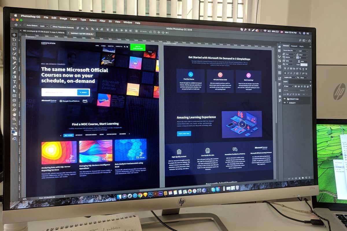
8 Use Visuals To Keep People Engaged
You want users to stay active on your page for as long as possible. One way to achieve that goal is to provide them with the information and tools they need to navigate easily. At the same time, you want to embellish the visual component of the site itself.
The incorporation of visuals is one of the core web design principles. Photos, artistic designs, and videos are all great ways to keep your users engaged while they browse. Visuals can also leave a more lasting impact that will hopefully see them return for more.
If you’re designing an online portfolio, images become even more important. Choosing images that capture attention is crucial. But at the same time, they must represent your brand. Select visuals that tell a story and have a cohesive feel for the best results.
9 Don’t Be Afraid Of White Space
Clutter is a much bigger problem for websites than white space. Leaving sections clear from any content might feel unbalanced. But for content-saturated consumers, it’s a welcomed breath of fresh air.
White space cuts through the density that users are often trying to avoid, and allows them to focus even more on the content you do choose to include. Don’t be afraid of having a bit of “empty” space on your website. It’s important for visual balance and ease of focus for consumers.
10 Be Consistent
Websites should have an overarching sense of continuation and consistency throughout. You want users to recognize the page they’re on each step of the way. Starting at the home page and going all the way to the FAQs.
Consistency communicates professionalism and brand self-awareness. It shows users that you know who you are. And that you’re committed to one cohesive design concept. Keep your fonts, colour scheme, and general tone in alignment for a more mature representation of your work.
The Bottom Line
Using these web design principles, you can create a site that’s engaging, user-friendly, and encourages retention. These principles are all simple to implement, yet highly effective. Adapting your design process to include them will result in a site that drives traffic. All while delivering the best user experience possible.
